m.e.designlab
  • home
  • studio
    • about m.e.
    • why choose m.e.?
    • services
    • testimonials
    • awards
  • portfolio
  • beverages
  • restaurants
  • connect
    • contact m.e.
    • blog
  • Menu Menu
You are here: Home1 / Blog
Beer-Type Logos

Beer-Type Logos Resurrected

January 10, 2023/0 Comments/in Branding, Logo Design/by Matt Everley

It’s been 7 seven years… and 5 years since any posts to my personal beer branding project called Beer-Type Logos. I have missed it for two reasons:

  1. Because I don’t get to show off my beer branding skillz.
  2. Because I don’t get to show off my beer branding skillz!

Yes, I realize both reasons are the same, but hear me out. I started this logo design project waaaaay back in 2015 in order to be inspired and inspire others. I was continually on the lookout for new craft beers to try, new fonts to try, and a way to display my passion for both. The logos themselves were a ton of work, but I’ve missed creating them. I also endured this project in order to garner relationships with craft breweries (and other beverage companies) and to get more graphic design work in the craft beer market. Well, it happened! So now almost 7 years later, I get to show off my skills again, but this time for logo designs, packaging, websites and other marketing collateral created as by-products of my Beer-Type Logos.

About the Beer-Type Logos Project

For the entire year of 2015, I challenged myself to design 52 logos—1 per week—using a different font to create a unique brewery-style beer logo. The driving factor of the design for each beer-type logo was the font itself. The name of the font and the style dictated the direction of the logo and whether or not I made it all type or integrated other design elements such as icons, flourishes, etc.

About the Resurrection of Beer-Type Logos

For the entire year of 2023, I’m challenging myself once again to promote the type, design, and inspiration behind some of my favorite logos, packaging, websites and marketing collateral I’ve created since the launch of the original Beer-Type Logos. You can read more about the Resurrection of Beer-Type Logo Design and the reasons why on that website.

https://medesignlab.com/wp-content/uploads/2023/01/blog-title-image-BTL2023.png 300 600 Matt Everley https://medesignlab.com/wp-content/uploads/2025/11/medesignlab-icon-200.png Matt Everley2023-01-10 11:23:452023-01-10 11:23:45Beer-Type Logos Resurrected
Beer Package Design Award Winner

Graphic Designer Wins National Packaging Design Award

May 18, 2021/2 Comments/in Branding, Press Releases/by Matt Everley

HICKORY, NC          Matt Everley, of Hickory-based graphic design studio m.e.designlab, was recently selected as a winner for a 2021 American Packaging Design Award by a nationwide panel of judges. The award recognizes excellence in communication and graphic design.

The competition was presented by Graphic Design USA Magazine. A highly selective 10% of the 2,000+ entries were honored this year. Everley’s winning entry was for the design of Blowing Rock Brewing’s “Bindle Box” 12-can variety pack.

“Creating a design to align well with a client’s brand position, yet differentiate them in a competitive market is always a challenge,” Everley said. “I’m fortunate to partner with breweries like Blowing Rock to develop creative packaging to compete with the ever-increasing growth of the craft beer industry, and this award reinforces the work we’re doing is being well-received.”

The Bindle Box variety pack can be found in stores across North Carolina, including Lowe’s Foods, Ingles and independent retailers, as well as the Blowing Rock Ale House in Blowing Rock, NC and the Blowing Rock Draft House in Hickory.

Everley has won numerous awards for logos, web sites, direct mail and corporate identity systems including several previous American Graphic Design Awards over the last 18 years. Matt resides in Hickory with his wife and three daughters. His portfolio can be viewed at www.matte69.sg-host.com/portfolio. For more information, call 919-593-2092.

https://medesignlab.com/wp-content/uploads/2021/05/BR-bindle-box-package-design-award.jpg 425 640 Matt Everley https://medesignlab.com/wp-content/uploads/2025/11/medesignlab-icon-200.png Matt Everley2021-05-18 10:32:002021-06-04 10:27:05Graphic Designer Wins National Packaging Design Award

How to Take Headshot and Bio Photos for Websites and Marketing Communications

September 19, 2020/0 Comments/in Opinion, Tutorials, Web Design/by Matt Everley

Matt Everley - Graphic Designer in Hickory, NCAs a web designer, I frequently receive headshot photos and other bio images to place on “about us” or “our team” web pages. More often than not, these are taken with someone’s mobile device, and the quality is, well… crappy. This is not due to the quality of the camera—because let’s face it, cell phone cameras these days are better than most older, traditional cameras. It’s the way the images are shot that makes the difference.

Professional photography is ALWAYS recommended, but it’s well understood that time, budget and other factors come into play which may prevent you from employing a professional photographer to take headshots. Here are just a few helpful tips for shooting these types of photos at home or your place of business.

5 Do-It-Yourself Headshot Photo Tips for Your Website

Headshot Photo Tip #1: Take Photos on Backgrounds Other than a Blank Wall

Blank wall backgrounds are good for passports and driver’s licenses, but do you want your headshot to look like a passport or driver’s license? Get creative with your background. Choose a background with some context for your industry. A factory setting is great for manufacturing. Outside is great for Landscaping. An office setting is great for, well you know, an office! If nothing else, choose a brick or stucco wall—something with a good bit of texture or color, and not just plain blah.

Headshot Photo Tip #2: Have the Subject Stand Away from the Background

I’ve seen it a thousand times. The person is glued to the wall behind them! Step away from the wall or whatever objects are behind you. This will create depth, some nice shadows, and show that you are welcoming.

Headshot Photo Tip #3: Step Close to the Subject

Even if you are wearing your favorite outfit of all time, don’t take a photo of your full body. You want the focus to be on your face and likeness. Showing up close and personal helps to communicate how approachable you would be in a face-to-face meeting.

Headshot Photo Tip #4: Use Natural Light—Don’t Use a Flash!

Want your photo to look like a crime scene? Then don’t use a flash! Take the picture outside or close to a window with natural light. Taking photos with the flash on will only look amateur.

Headshot Photo Tip #5: Don’t Crop from an Image with Other People

It may be your all-time favorite picture of yourself, but if you’re cropping yourself out of a picture with someone else you are not thinking professional. What happened to that other person? What did they do to deserve this? Why do you hate them so much that you had to crop them out? That’s where my mind goes when I see this on LinkedIn, Facebook or any other profiles or websites.

Exception: If you’re in your natural/work environment, and you crop your headshot from an “action” shot in your office or industry, this is totally acceptable. Even if you are not looking straight into the camera, this is a great way to display how or what you do!

Why Do I Need a Better Headshot Photo on My Website?

Your photo represents your company AND your brand. Low quality, unprofessional photos on your website and in other marketing pieces will communicate the same about your organization and the products and services you offer. Always choose professional photography services if your budget allows! But if not, follow these tips, because customers want to get to know YOU–and what better way to do this than with a great looking headshot!

Bonus Tip: What to Provide to Newspapers for Press Releases

bad newspaper registrationAlways provide a black and white (grayscale color mode) to newspapers. Have you ever seen how bad a picture in the newspaper looks when the registration is off? When the paper prints, it lays down 4 different separations for Cyan, Magenta, Yellow, and Black (CMYK). If these layers don’t line up, the picture looks TERRIBLE. To avoid this, submit a grayscale photo. (You may need Photoshop or another imaging program to do this properly—a gray image from Instagram or another platform is not in true “grayscale”.)

https://medesignlab.com/wp-content/uploads/2025/11/medesignlab-icon-200.png 0 0 Matt Everley https://medesignlab.com/wp-content/uploads/2025/11/medesignlab-icon-200.png Matt Everley2020-09-19 15:38:582021-05-19 15:39:59How to Take Headshot and Bio Photos for Websites and Marketing Communications
Beer-Type Logos Art Museum Exhibit

Craft Beer Logo Design Exhibit at Hickory Museum of Art

June 19, 2017/0 Comments/in Branding, Logo Design, Press Releases/by Matt Everley

HICKORY, NC

BEER-TYPE LOGOS

Dates: June 17 – September 17, 2017
Entrance Gallery – Hickory Museum of Art

Hickory, North Carolina graphic designer Matt Everley challenged himself to create 52 brewery/beer logos in one year, each using a different typeface. The font itself became the driving factor for each logo design. His small, one-off type treatments for Granite Falls Brewery served as inspiration for his own line of brewery-style logo designs. This is the first time the entire collection of 52 logos will be on exhibition.

Hickory Museum of Art
243 Third Avenue NE
Hickory, NC 28601

Get Directions to the Museum »

Beer-Type Logos Opening Reception

The Opening Reception for Beer-Type Logos Design Exhibit was a BIG success!

Thank you to everyone who attended the Opening Reception. We had a ton of fun enjoying complimentary pours of Ossem IPA from Granite Falls Brewing, toasting at the bottle share and hanging out with everyone. Be sure to stay tuned for the winning logo that will be brewed this fall, and go by the art museum and vote on your favorite if you haven’t already!

More about the Beer Logo Designer…

Everley designed the Lake Norman Folk Art Festival’s unmistakable “swimming chicken” logo and created the soon-to-be-as-famous pig logo for the Foothills Folk Art Festival.

Visit the Beer-Type Logos website for more information on this project.

Save

https://medesignlab.com/wp-content/uploads/2017/06/beertypelogos-HMA-1.jpg 400 600 Matt Everley https://medesignlab.com/wp-content/uploads/2025/11/medesignlab-icon-200.png Matt Everley2017-06-19 11:09:252017-08-15 13:55:35Craft Beer Logo Design Exhibit at Hickory Museum of Art

Hickory NC Graphic Designer Wins National Design Awards

September 28, 2016/0 Comments/in Press Releases/by Matt Everley

HICKORY, NC          Matt Everley, of Hickory-based graphic design studio m.e.designlab, was recently selected as a winner for three 2016 American Graphic Design Award by a nationwide panel of judges. The awards recognize excellence in communication and graphic design.

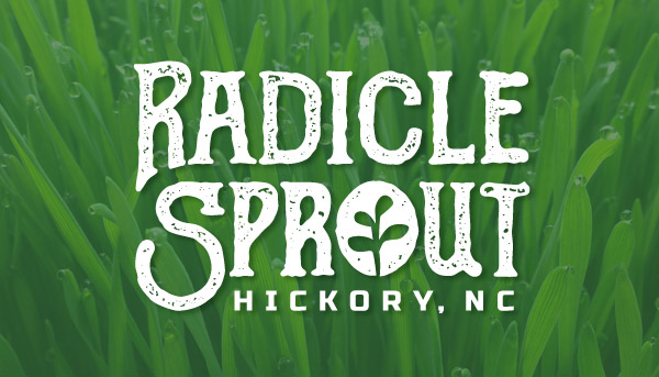
The competition was presented by Graphic Design USA Magazine. A highly selective 15% of the 10,000+ entries were honored this year. Everley’s winning entries were for the logo design and development for Radicle Sprout—a Hickory, NC-based urban microgreen farm, CD packaging design for “Greatly He Redeems”—written and recorded by Paul Cummings, and brochure design for Sea Trail—a golf and beach resort in Sunset Beach, NC. The selected pieces and design credits will be featured in GDUSA’s December issue, “2016 Design Annual” and can be viewed online at www.gdusa.com.

Everley has won numerous awards for logos, web sites, direct mail and corporate identity systems including several previous American Graphic Design Awards over the last 14 years. Matt resides in Hickory with his wife and three daughters. His portfolio can be viewed at www.matte69.sg-host.com. For more information, call 828-441-0010.

Logo Design for Radicle Sprout:

Radicle Sprout Logo Design

CD Packaging Design for “Greatly He Redeems” by Paul Cummings:

Album Cover Design

Trifold Brochure Design for Sea Trail Resort:

Sea Trail Resort Brochure Design

Save

Save

Save

Save

https://medesignlab.com/wp-content/uploads/2025/11/medesignlab-icon-200.png 0 0 Matt Everley https://medesignlab.com/wp-content/uploads/2025/11/medesignlab-icon-200.png Matt Everley2016-09-28 22:24:542016-10-04 10:22:17Hickory NC Graphic Designer Wins National Design Awards
Page 2 of 10‹1234›»

Categories

  • Branding
  • Logo Design
  • Opinion
  • Packaging Design
  • Portfolio
  • Press Releases
  • SEO
  • Tutorials
  • Web Design

Archives

  • September 2026
  • November 2025
  • May 2025
  • May 2024
  • May 2023
  • January 2023
  • May 2021
  • September 2020
  • June 2017
  • September 2016
  • August 2016
  • June 2015
  • April 2015
  • December 2014
  • September 2014
  • August 2014
  • July 2014
  • April 2014
  • March 2014
  • December 2013
  • October 2013
  • August 2013
  • April 2013
  • October 2012
  • February 2012
  • January 2012
  • December 2011
  • November 2011
  • October 2011
  • August 2011
  • January 2011
  • December 2010
  • October 2010
  • August 2010
  • July 2010
  • June 2010
m.e.designlab - Hickory, NC graphic design studio

A branding and graphic design studio in Hickory, NC since 2005.

home   services   portfolio   studio   connect

Facebook Instagram LinkedIn

Scroll to top Scroll to top Scroll to top